Value Scale Drawing - A Practical Beginner’s Guide

Few drawing exercises are as effective at improving the quality of your drawings as the value scale.
In fact, it’s more than just a simple exercise.
Value scales help you plan drawings, master new materials and much more.
This article covers the ins and outs of how to practice and use them in your work:
What a value scale is
Why you should care about value scales
How to draw value scales in:
Graphite
Charcoal
Colored pencil
Hybrid versions
Tips for speed, smoothness and applying them to your drawings
Let’s get into this exciting topic!
What Is A Value Scale?
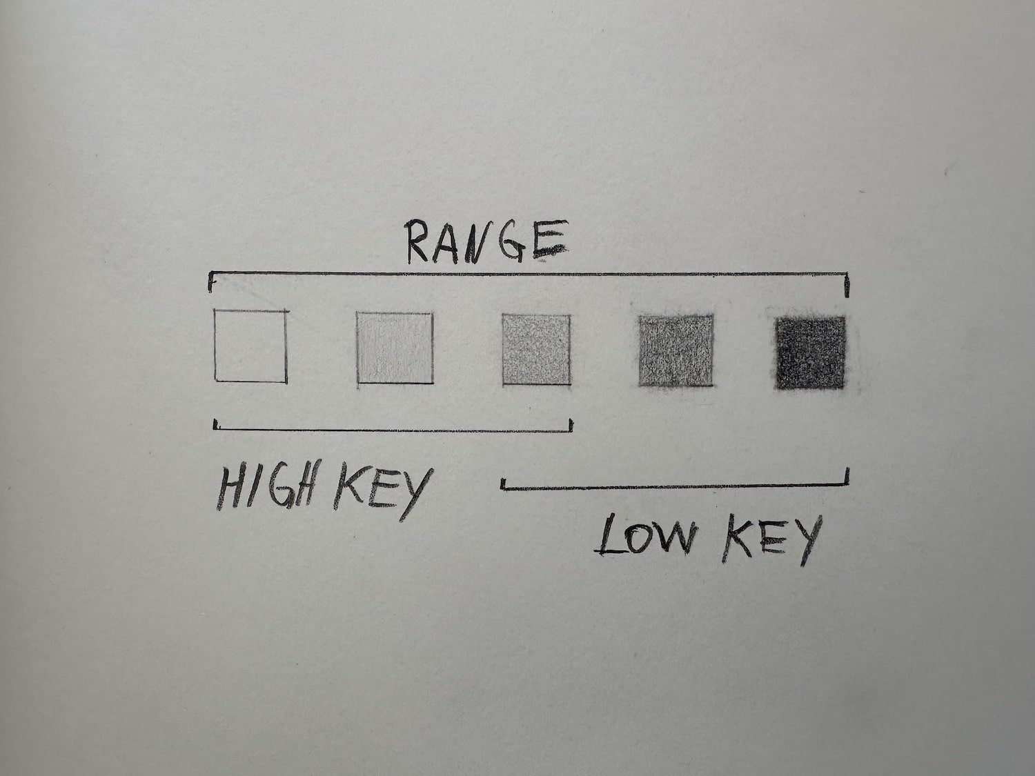
A value scale is a series of boxes filled with tone, that go from light to dark value in equal steps.
The difference between the lightest and darkest value is called “value range”.
Drawings that mainly use light values are sometimes called “high-key” drawings. Drawings that mainly use mainly darks are called “low-key” drawings.
Why Care About Value Scales?
Most beginners start drawing linearly, but eventually want to get a 3D realistic look.
That’s when they move into the world of tone and form.
And that’s when value scales become a crucial skill to master.
Practically, value scales teach you to:
Plan the value range of your drawings
Consciously design the tonal composition of your drawings
Create smooth-quality shading
All in all, they got direct carry-over to how 3D your drawings look (especially in combination with cross contour drawing).
How To Draw A Value Scale

How to fill a box with smooth tone.
To draw a value scale, simply follow these 3 steps:
Draw three 1x1cm boxes next to each other. You can also draw them free-hand if you have no ruler handy.
Fill the box on the very right with the darkest value.
Fill the middle one with a middle value.
It’s important to aim for smooth tone. You can achieve this by making marks top to bottom, one at a time, and avoiding zigzag marks, as shown in the image above (shoutout to Chris Legaspi who taught me this important tip).
We’ll cover more tips for high-quality value scales later, but first let’s get into the materials.
Graphite Pencil Value Scale

The above image shows three value scales done in graphite: A 3-step, 5-step and 7-step value scale.
For most purposes 5 steps are great, but definitely try the 7- or even 10-step scales to push your dexterity.
As you can see, graphite is an excellent tool for high-key drawings, and controlling light values. It’s just easy to consistently draw those with an HB or B pencil.
On the flip side, graphite doesn’t produce a dark black, which makes it unsuitable for drawings that are very dark in value.
Let’s see how charcoal compares.
Charcoal Value Scale

This value scale was done with a Wollf”s Carbon 6B charcoal pencil, a small sable brush to smoothen the tones, and a kneaded eraser to clean up the borders.
Compared to graphite, charcoal creates very dark blacks. Getting the light values was also possible, but required smudging, at least on the paper I used.
Given charcoal is a messier medium, drawing a clean value scale in charcoal is an excellent exercise for learning to control it.
Hybrid Value Scale

Graphite and charcoal combined in one value scale.
If graphite is great for light values, and charcoal for dark values, why not combine them? This is something I learned from my teacher Chris Legaspi.
As you can see this combination is excellent for getting very controlled smooth light tones and dark blacks.
The challenge is that both materials behave differently. Charcoal is powdery and messy, graphite hard and controlled. Practicing your scale teaches you to switch techniques between both materials and avoid handling mistakes as you do a real drawing.
Black And White Pencil On Toned Paper Value Scale
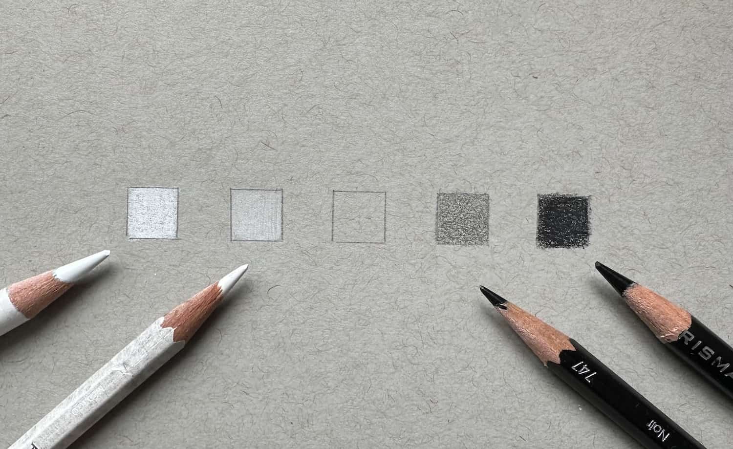
This is a combination professional illustrators use as it gives you great range without the messiness of charcoal.
It combines 4 pencils:
Prisma Color Premier white for the lightest light,
Prisma Color Premier black for the darkest dark
Prismacolor Verithing white for light mid-tones
Prismacolor Verithing black for dark mid-tones
It’s also great for speed, as the toned paper spares you from having to tone the paper yourself. If you like this combination, check out my toned paper drawing article.
Gradations (Gradient Value Scales)
Once you can draw decent value scales, it’s helpful to practice gradations.
In nature gradations describe roundness of forms, which means you’ll need them all the time while drawing. Thus, practice them as a scale!

Use your finger as a blending tool.
Again, the trick is NOT to make zigzag marks, but to lift the pencill after each stroke, and go top to bottom.

Repeat the process a few tomes to get a smooth gradation.
Now that you’ve seen many examples of scales, let’s get into tips for better quality.
Tips For Drawing High-Quality Value Scales
Tip 1: Vary Grips
Varying the way you hold your pencil greatly impacts the value range you can get out of it.
Experiment with the backend grip for lighter tones, overhand for middle tones, and tripod grip for darks. If you’re unsure what that means check out my drawing practice article, where I cover the three grips in depth.
Tip 2: Build Up Directions In Layers
As mentioned before, I recommend making marks vertically top to bottom at first, to see how far that gets you. Always using the same direction of strokes creates a uniform tone design that does not distract your eye.
You can always layer on horizontal strokes, to push the darks even darker or to lightly smoothen out the tone.
Keep in mind though, that combining mark directions changes the design of your tone, so use it consciously.
Tip 3: Chose The Right Material
Use the right materials for the right job! This comes with practice and getting to know a range of materials, but over time you’ll get very good at judging which material is best for which value scale.
How To Apply Value Scales To Your Drawings
Last but not least, how do we use value scales to create more beautiful drawings?
Just practicing your scales will already have an immediate effect on your drawings, as it trains your hand execution, your material mastery, and your eye.
But, beyond that, value scales are a valuable planning tool you should use before starting any longer drawing effort.
Here’s what you can use them for:
Decide on the value range, number of values, & set of materials you will use to achieve this value structure, BEFORE starting a drawing
Draw that scale on a piece of paper
Decide on what values you use in the lights, and what values you use in the darks
-> As you draw, use that scale to keep yourself in check: Are you sticking to your value scale?
The more disciplined you are about controlling your values and sticking to your design decision, the clearer your drawing will read!
Closing Thoughts
That’s it! I hope you are sold on value scales, as they were a game changer for me, and I continue to work on them.
If you’d like to learn more about how to apply this skill, check out my article on value drawing.
If you are new to the site, make sure to read the drawing fundamentals and how to practice drawing articles.
They are the cornerstone pieces that describe the learning philosophy of this site.
See you soon!
Felix